ENGLISH
    • 한국어
    • ENGLISH
    • 日本語
    • 中文-繁體

    2021.02.09 Our Way

    NC TYPE PLAY – Game, Reborn as A Language That Is Alive. Desinger Gyu-hyung Cho

    Creator Crew:

    The people expanding the boundaries of fun through connecting NC’s contents with their creativeness  

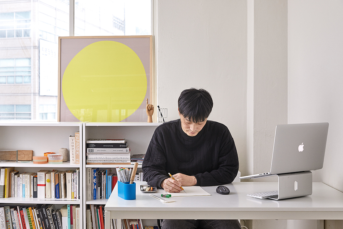
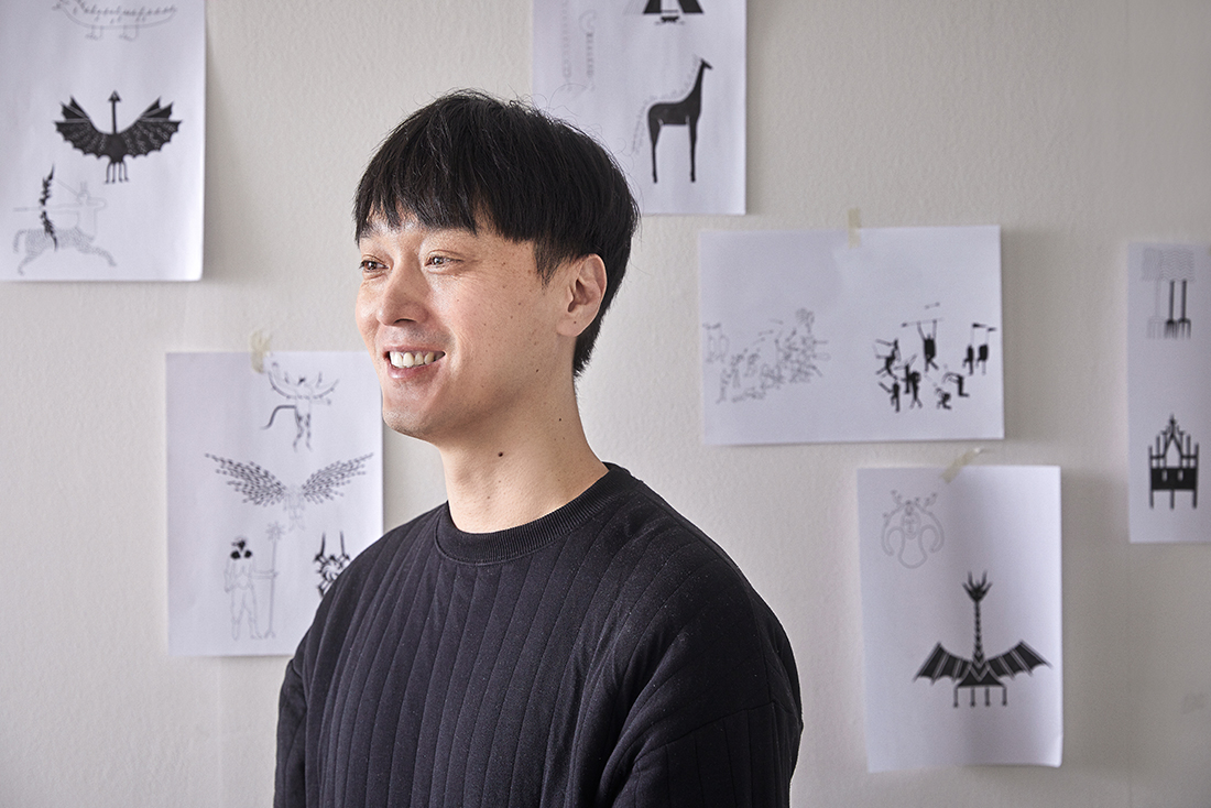
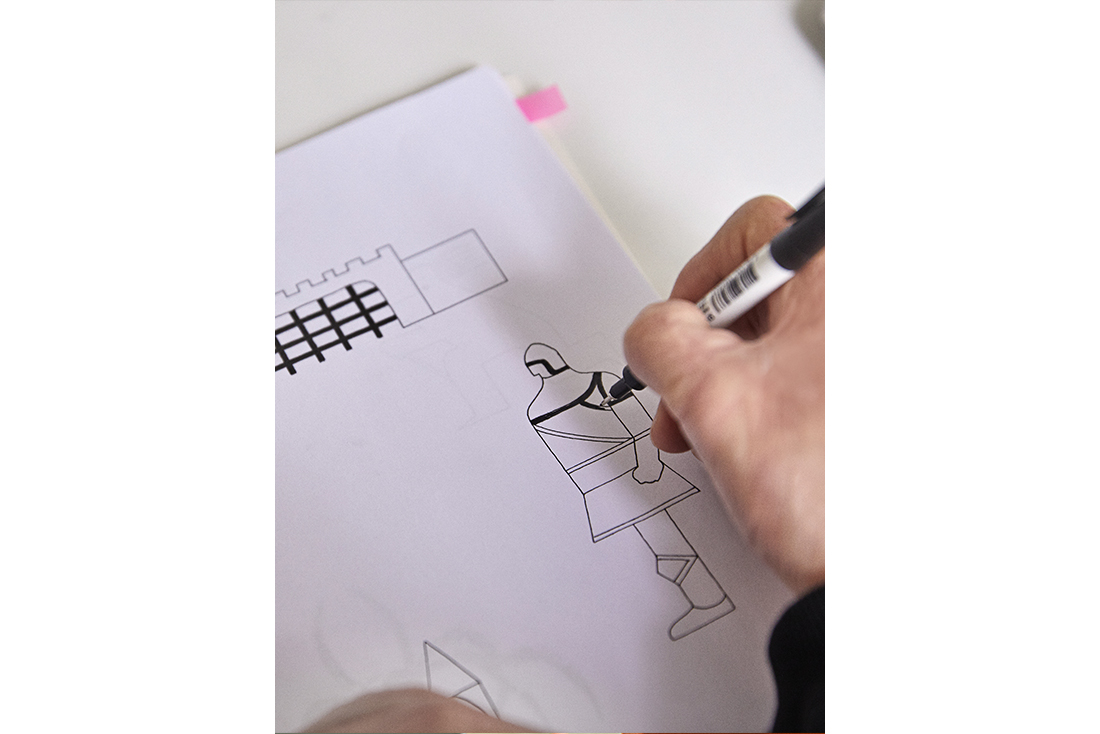
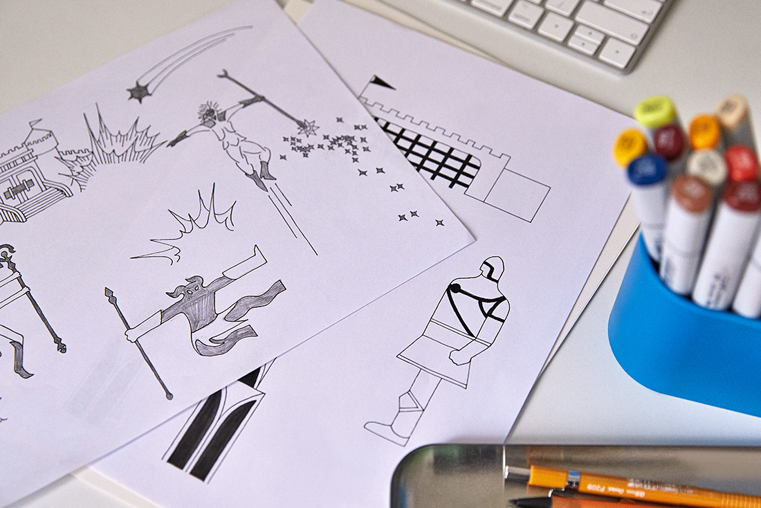
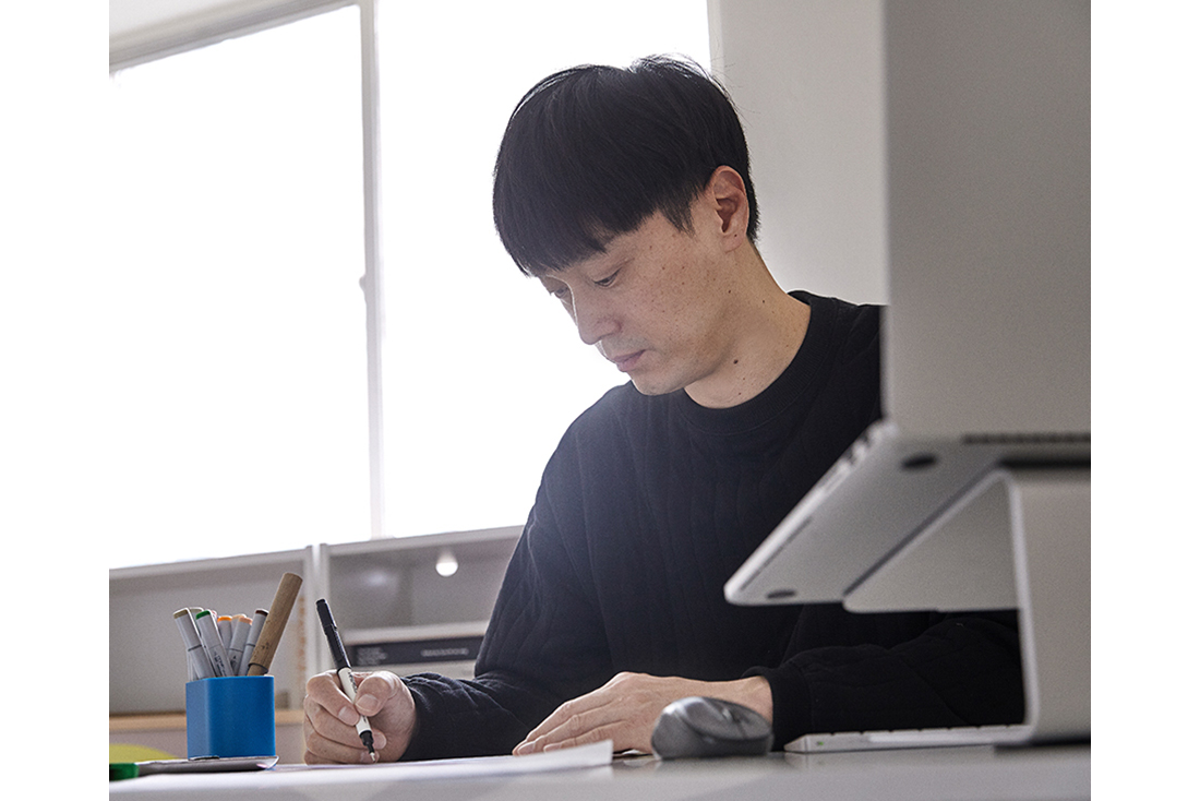
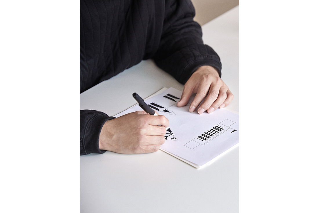
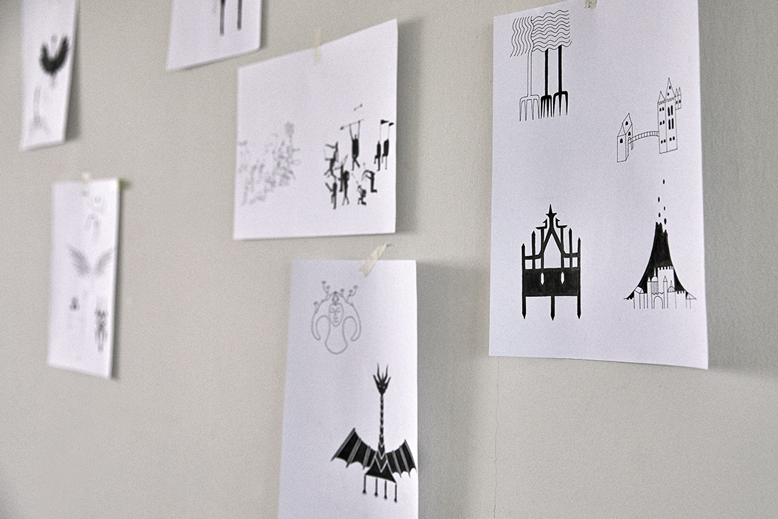
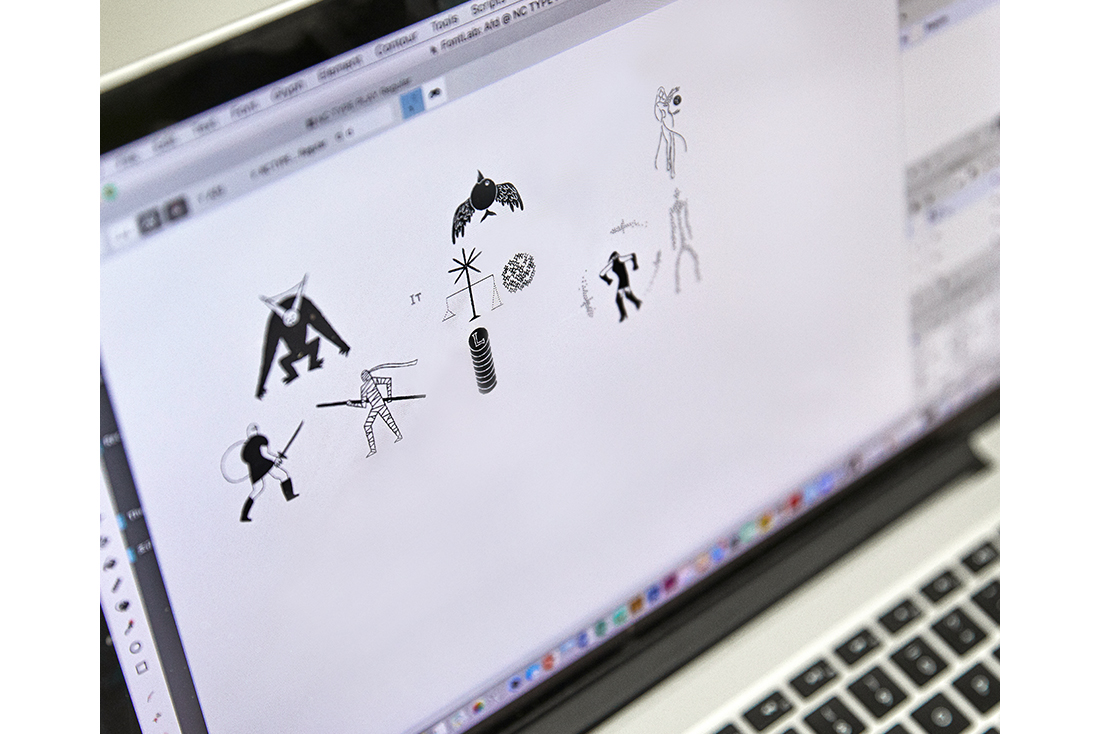
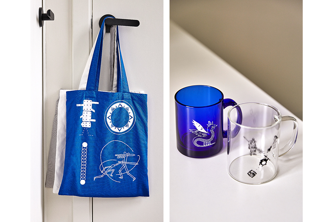
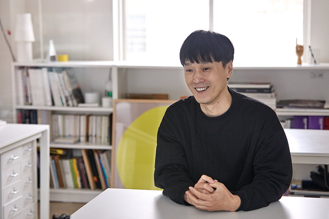
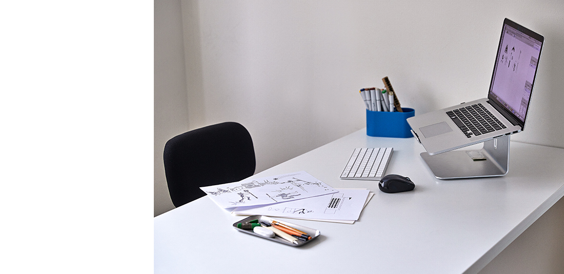
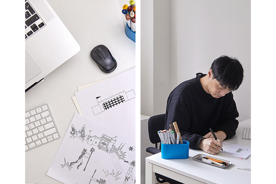
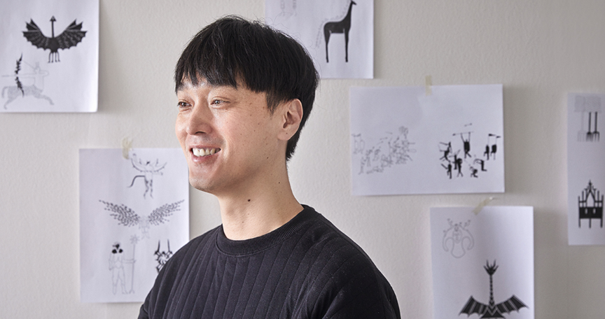
    An image pops up on the computer screen, when letters are entered. An image of two warriors swinging their swords appears, when the letter “A” is entered. Fonts that are composed of images, instead of letters, are called image languages. NC’s game playing was transformed into an image language that everyone could use. Designer Kyu-hyung Cho reinterpreted games into image languages through . His image language design works have first received attention from the people outside the country. The reporter met Cho and listened to his story on how the interesting image languages of < NC TYPE PLAY > were born and how these would extend the boundaries of fun. 

    Online Exhibition → https://nctypeplay.com


    Discovering Stories Existing in Every Moment

    Please explain < NC TYPE PLAY >, your recent project with NCSOFT

    < NC TYPE PLAY > is an image language, developed based on various game playing moments in NCSOFT games. It is also called a dingbat font. As light, bold, and italic fonts are provided for the alphabet and Hangul (the Korean letters), I created regular and level-up fonts for < NC TYPE PLAY >, an image language. Depending on combination of letters, fonts, and one’s preferences, numerous stories could be told.

    What prompted you to participate in the project, < NC TYPE PLAY >?

    I have got a master’s degree from a university in Sweden in storytelling. I prepared an image language project for submission before graduation, and fortunately, the work was featured on the cover of 《Wallpaper》. Since then, I have worked on transforming the alphabet and Hangul into image languages. The image languages that I worked on at the time were more of an art work, instead of the one for general use. As a result, as time went by, it seemed that the work has lost its sense of vitality. 

    However, < NC TYPE PLAY > prioritized creation of an image language for general use, which could be used by everyone and would continue to extend its life. I was happy to participate in the project, considering that it was a new challenge for me to design a font that could be downloaded, owned, and freely used by many people. 

    It is interesting that you studied storytelling in Sweden. What prompted you to study storytelling as a designer?

    In the past, I worked in many CI creation projects to visualize clients’ stories in a condensed form in a local branding company. I decided to study abroad, believing that I wanted to express my own stories in a non-conventional way. In the department of storytelling, they teach how to focus on the stories themselves and to deliver the stories through various media. Stories are in everything, and therefore, they could lead to any results through any processes.

    Then how are stories important to your work?

    My work is to observe an object in everyday life and to imagine to create a story. I believe that the created stories should be used in everyday lives, instead of just being appreciated or maintained for personal use, to make them more meaningful. The image language was created in the form of fonts, instead of paintings inside frames, so that people could use them to express their stories. 

    Image languages seem like an important work, showing the importance of ‘usability of stories’. Why did you get interested in font designs in the first place? What is your most representative project?

    At first, languages seemed like a person working constantly to deliver information from signboards, books, etc. I tried to remove the function for information delivery and set the languages free. It seemed like the only way to let the languages tell their own stories. That is why I tried to create a less readable language, and that is how I created the image language.

    Next, I mulled over ways to utilize the image language. For its commercialization, I thought about ways to make it more tangible. The lyrics that a child likes became a blanket where patterns made of image languages were embroidered, and the love letter from one’s late husband became a wallpaper made of image languages. The stories ultimately became tangible and usable objects. This project attracted attention and became my representative work.

    Games, Transformed into Living Letters

    < NC TYPE PLAY > was a project to transform games into a language. Were you interested in games?

    I relax through concentrating on playing games. I believe that game playing is an exercise to help keep one’s brain agile. I have continued to pay attention to the games of NCSOFT, because its scenes are very beautiful. There are many types of game contents in NCSOFT, and Lineage’s version 1 and 2 are different. There was a mixture of Asian and western contents, and most importantly, the monsters attracted my attention, since there was a variety of their forms, sizes, and stories.

    How did you carry out the research to reinterpret the games?

    First, I got insights through reading and analyzing the game images and stories. I played the games and reviewed user responses. In particular, since “TYPE PLAY” project itself was about movements, I spent endless days to watch game graphics.

    To be immersed in the games, I considered myself a game character and asked various questions, including “how would I attack my enemies?”, “from which angle should I fight to win?”, and “which character should I choose as my partner to win?”, and found answers. Meanwhile, I designed structures through creating letters based on the stories and created a large number of drawings.

    Did you have any standards or rules in the design of image letters?

    In < NC TYPE PLAY > project, instead of trying to discover source information to create letters, I draw movements of interesting characters and situations they were in. I believe that the number of drawings was three times larger than the one actually applied. For instance, the letter “A” needs a triangle and two diagonals. Then I chose the drawings that had the aforementioned elements, had the right movements, and would bring changes to the stories.

    How did you choose a character that suits a certain letter?

    For instance, as the letter “A” required a triangle and two diagonals, I decided that two warriors and a triangular-shaped monster would create the capital letter “A”. That is how I created a structure that covered from “A” to “Z” and that could be read as letters. However, in this situation, it could seem boring if both warriors used swords. Therefore, one would use a sword, while the other would use a rod. One would wear an armor, while the other would be bandaged. This is how I chose letters to let different characteristics of each character, formative harmony, and their relationship be revealed. Each alphabet entails stories. 

    There are regular and level-up fonts and even special symbols in < NC TYPE PLAY >. How did you create the difference?

    Regular fonts reflect the situations that the characters are in, while level-up fonts visualize interactions between them. I wanted to cause admiration from users, when the letters are changed from regular fonts into level-up ones. I wanted them to discover new stories and new movement of characters once they level up.

    For instance, the letter “A” in regular font is composed of two warriors and a monster, and they form a triangle. However, in level-up font, the same letter includes one warrior swinging his sword, while the other wields a rod. Unlike in creation of regular fonts, when creating level-up fonts I focused on letting the characters escape from their fixed forms, stay alive, and create relations. In creation of regular fonts, I focused on making users wonder about the stories, while concentrating on expressing movements and creating intense stories when creating level-up fonts. 

    What is the major difference between the design of ordinary font and image letters?

    Ordinary fonts require readability; it should enable easy reading of letters. However, in the case of image letters, they should also show stories. The letters should stay alive, while revealing characteristics of each character. It is the most important to take the right balance between the two. The formative beauty, relations between characters, and their characteristics should generate harmony and vitality.

    How did you generate harmony between NC’s identity and your personal preference in the project, < NC TYPE PLAY >?

    All of my work comes from my head and is created through my hands. Therefore, there is no need to be obsessed with the idea to maintain ‘my style’. My identity is blended in all works. My projects would always be the same time without communication with external entities.

    I appreciate the requirements from clients, as it encourages me to work better. It makes me alter my identities and helps create new work. Clients are my ‘partners’ that create projects together through communication. < NC TYPE PLAY > was also a joint project with the games that NCSOFT has continuously created. 

    Fun Extends, Once Stories Are Connected

    Why would you embed meanings in words and create stories, instead of only creating letters that are considered beautiful from a design point of view?

    Design is not only about creation of beauty. It is a designer’s duty to contain information in a visual object and deliver it to people. I believe that design must contain meanings and stories. 

    Everyone has stories. Stories are created once people are gathered. Stories may also be connected once they are gathered. It will help us discover and extend new fun. < NC TYPE PLAY > may connect the letters, letting them create and extend stories. My role as a designer is to create such a fun environment.  

    How do you want the users to enjoy and use the fonts of < NC TYPE PLAY >?

    I hope that the users would enjoy playing with the fonts, just as they play games. I hope they could find their stories and connect them with the image letters. 

    They could write down their name using the image letters to create a poster to put on their door, or product clothes and bags through printing the letters on the textile. It would be nice if they could make coloring books for their kids. I hope they could image many possibilities and produce various results. 

    What is your favorite combination in the fonts of < NC TYPE PLAY >? If you were to write down a word or a sentence with the fonts, what would it be?

    When you design letters, not a single letter should look more beautiful or stand out compared to others. For me, it is important not to make a single letter stand out while making other letters look bad, and therefore, I cannot say that a certain combination would look more beautiful and better suit my taste. But if I am asked to, I would say “Eun-yu (metaphor)”, the name of my new born in February. Therefore, “metaphor” would be my word of choice. 

    What change would the development of digital technology bring to font designs?

    Variable fonts were introduced four years after Korean image letters were released in 2016. They let users choose something in between regular and bold fonts, instead of forcing the users to choose either one of them. 

    As technologies evolve, users get to choose various options and develop needs to experience evolving multimedia that are in between stereotypical ones. In the future, I believe that the fonts with unprecedented formats would be developed, including the ones changing colors while being entered and having three-dimensional shapes. Once more people pay attention to this, carry out research, and participate, there is an infinite possibility where this would evolve in multiple directions. 

    To Discover the Stories that Are Waiting for Me

    What do you think is the most important thing in design?

    Silly imaginations bend the rules and offer vitality in design. However, no matter how beautiful and interesting, they will soon get forgotten once they are not used by people. Therefore, consistency with the purpose and aesthetics matter in design. In addition, it is important to pursue designs that are sustainable over the long term, instead of the ones that are showy and provocative. 

    What is your goal as a designer?

    In fact, many designers share the same goal to carry out design for a long time. I expanded my areas of expertise, because I shared such a goal. There was much to learn while I expanded my areas of expertise. I became a novice when I expanded into the area of furniture design from graphic design. It is very delightful to learn new things in a new area. I believe that if I am to keep doing what I love, I should not do it alone. I have a life-long design partner and a daughter. These days, I become happy to imagine myself carrying out new design projects with my family for a long time. 

    You are running “Studio Word”, with Jeong-yu Choi, your wife and a designer. What does the name of the studio mean?

    It was inspired by the song “Word” by Gregory Alan Isakov. The song is about words that change their meaning at night. Words have their literal meanings. However, their nuance changes in different times, places, and speakers. We named our studio after the song, because we wanted our design to have different meanings based on people, places, and times as was in the lyrics. 

    Lastly, please introduce us if there is any project that you are currently preparing.

    We are preparing for two exhibitions in November. We are working with an artisan making traditional Korean head gears (“gat”) to commercialize “gat”. We will also host an exhibition on records based on the recent trend of “newtro” (new+retro) in the old Seoul Sation building. I have done many projects this year and want to take some rest with my wife and my daughter, Eun-yu. 

    *The opinions expressed in this article are those of the interviewee and do not reflect the official position of NCSOFT.