Companies are like living organisms—they grow and develop with the environment over time. This is why brand identities should change along with the future of companies. Renewal is not creating something new, but realigning existing values and sharing a common brand mission in order to take the brand to the next level. The reason that game IPs with different roots, such as Lineage, Aion, and Blade & Soul were able to be grouped together under the NCSOFT brand was because they share the same core values—namely a commitment to quality and a passion for creating joy.
Expanding the brand’s potential without losing its consistent voice, while also visualizing and sharing that voice, was the core objective of this corporate identity (CI) renewal project. Here is a look at the renewal process and what went into making it happen.
Brand identity essentially sets the tone of a company’s brand. It enables consumers to identify and distinguish the brand and evokes specific feelings without even having to see the company’s name. Moreover, it represents the company’s goals and the values of its employees. This is why the renewal focused on the inherent values essential to NCSOFT, not merely on superficial visual elements.
Corporate Identity—The First Impression of a Brand
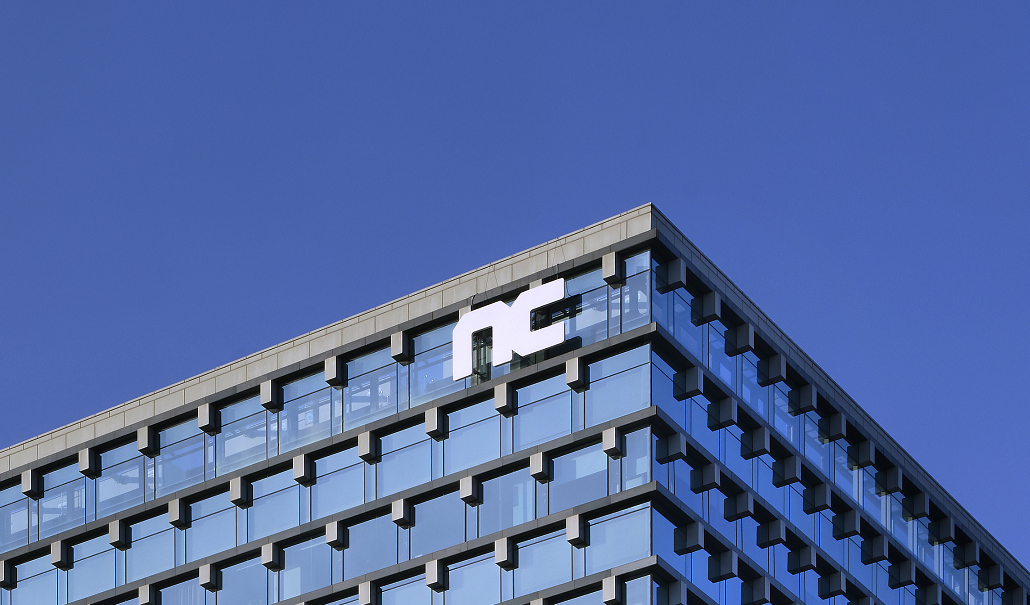
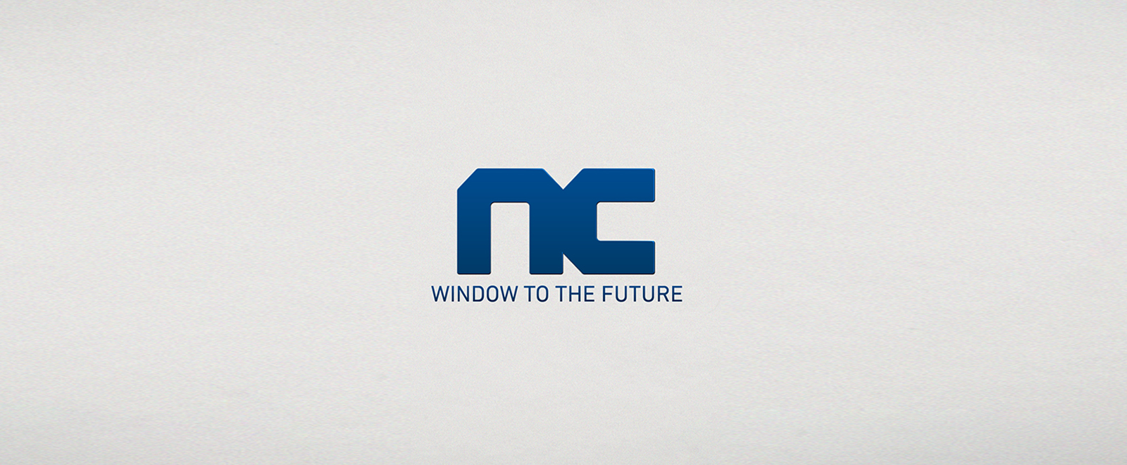
The intent of the CI renewal was to enhance global competitiveness and share the future values of NCSOFT’S gradually expanding global business. The CI design, which facilitates forming the first impression for the brand, had to contain the corporate values of NCSOFT. The final design was made in cooperation with Pentagram, the world-famous graphic design agency. The edges of letters cut at 45-degree angles show NC’s sincerity in its objective to create masterpieces based on cutting-edge technology. The bold letters emphasize NC’s bold spirit and passion, never hesitating to try something new and innovative. By leaving no space between the letters, the logo represents a new world that is connected.
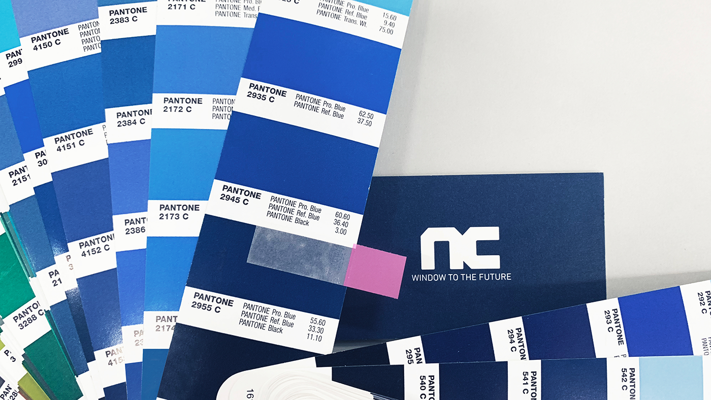
Colors of NCSOFT
The renewal project also produced new brand colors for NC. We removed extraneous color values from the CMYK color model of the previous CI’s main colors and filled in cyan at various percentages for sharper and clearer visibility. The newly designated NC BLUE Tint can now be widely used with NC BLUE in various applications.
Visual System—Expansion with Consistency
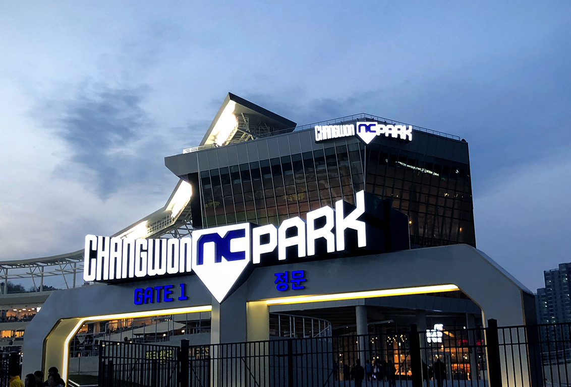
Considering the limitations of CI application for certain purposes, we developed a graphic motif to expand usability. It contains the cutting-edge design elements of the CI and can be used with more flexibility. The motif can be enlarged, reduced, or used in any kind of designing, such as in patterns, image frames, or layouts while at the same time presenting a consistent brand identity.
Pictograms must reflect a brand identity, but it is more important that it be intuitive enough for effective delivery of information. We tapered the edges of our pictograms to maintain our visual identity and strengthened the function of conveying information. The pictograms are images, but can also serve as text.
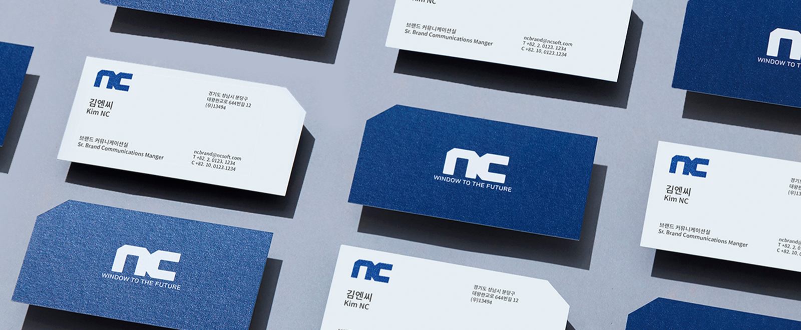
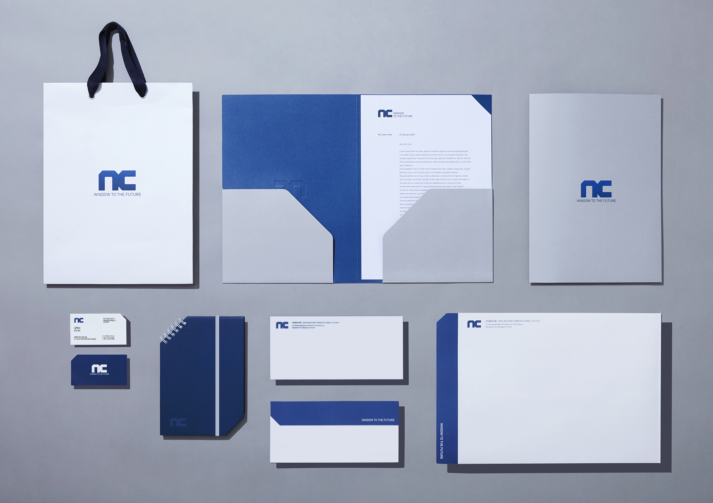
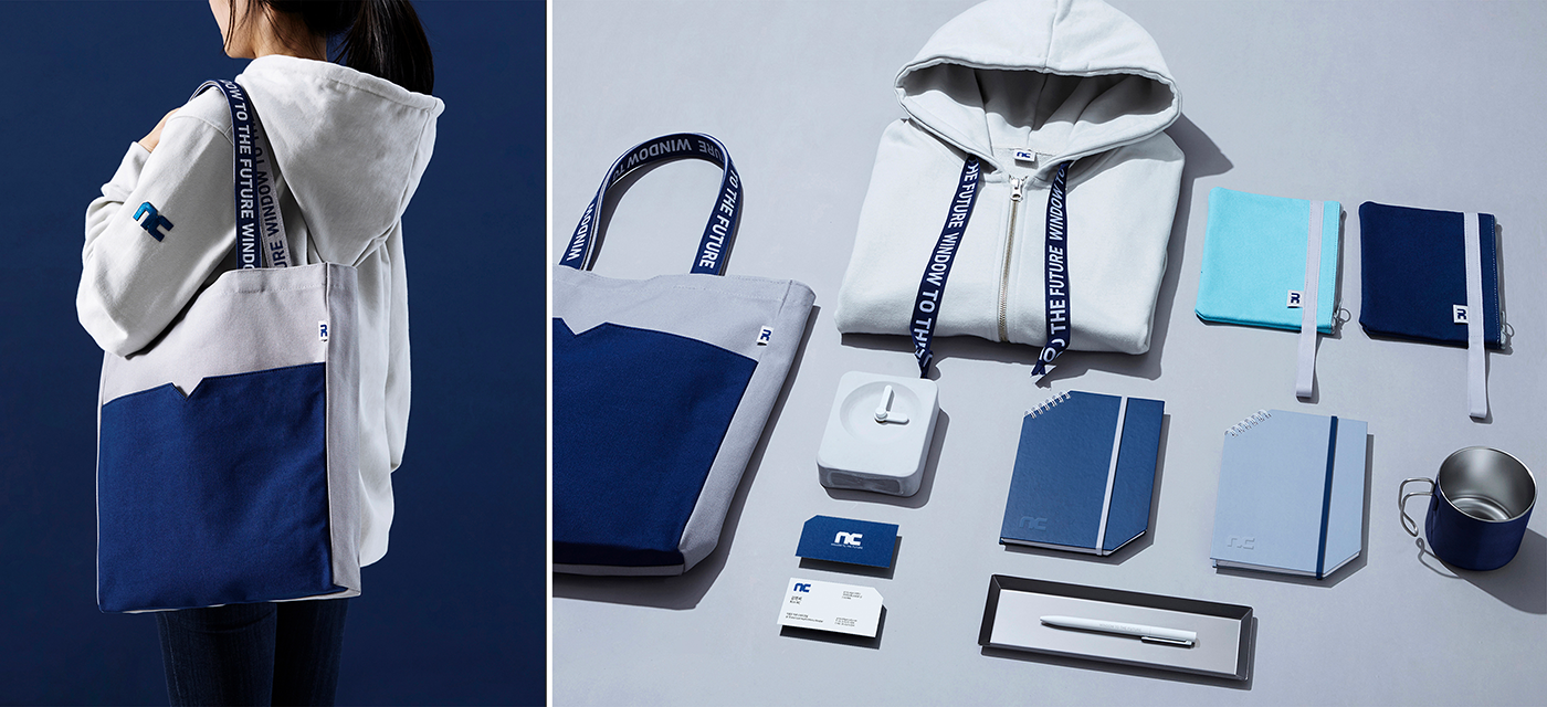
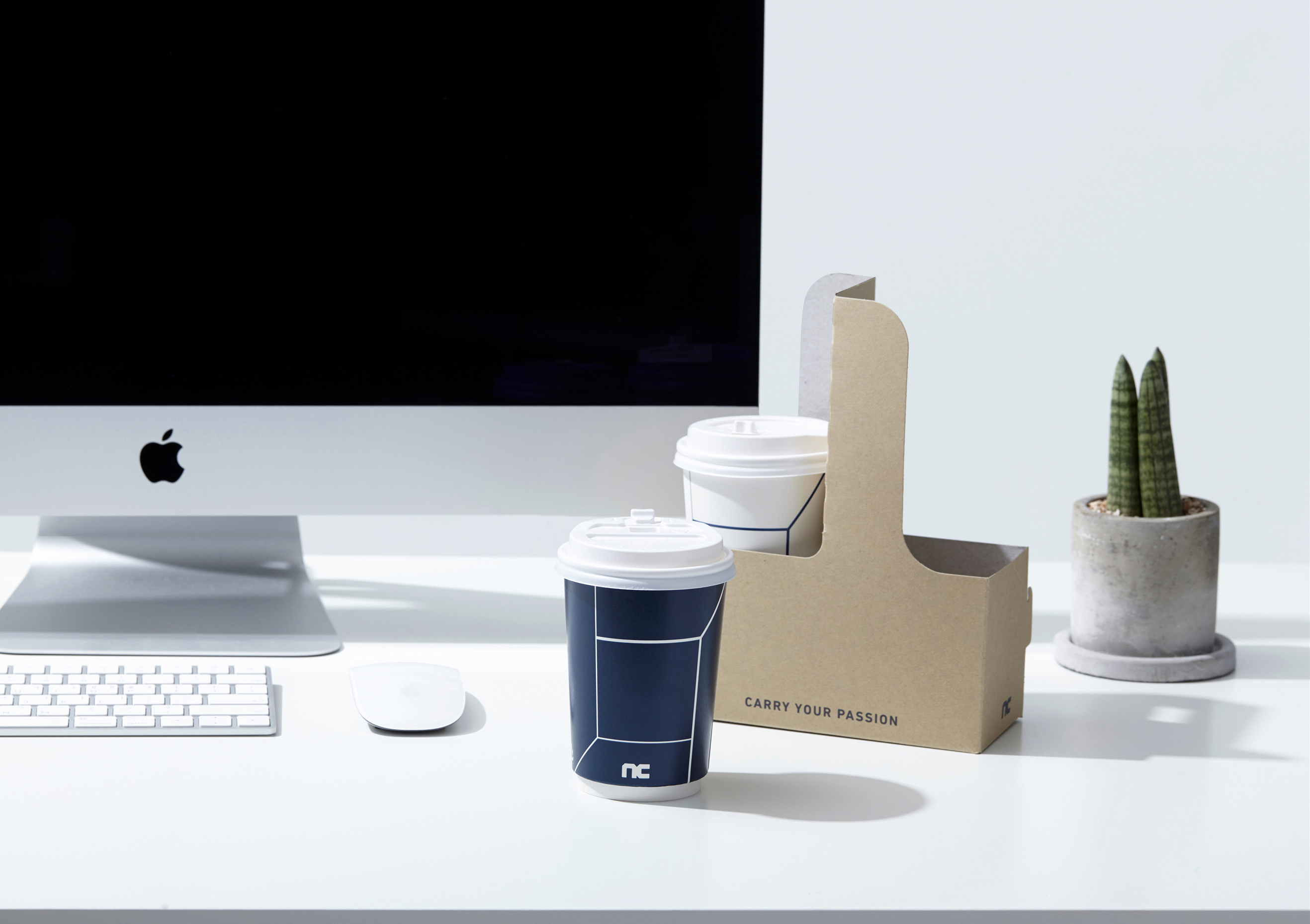
Merchandising—Feel, Wear, and Carry the Brand
Document forms and merchandise, where a brand identity is most frequently seen and touched, maintain a simple design with variations in the smaller details. We retained the core factors, such as brand color and CI, for an overall consistency, with accented cutting-edge details. Forgoing other decorative elements, NC’s merchandise gives off a simple yet intuitively modern vibe.
This renewed brand identity has been established as a guide for employees to freely download for application in various channels and content. This guide system will help NC to build and sustain a consistent voice.
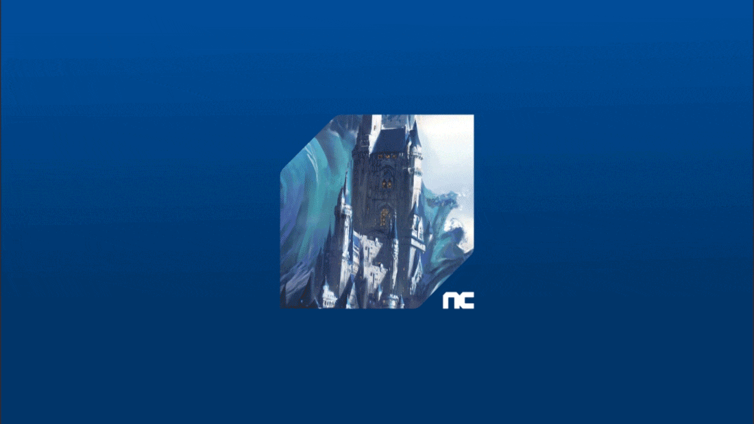
NC’s new CI includes the meaning of a “flexible window”. The window can be flexibly crossed over, or an image can be seen through it without becoming stuck as long as the form is not distorted. An image of a game IP can be applied in the CI for use as a window. NC held a contest for the new CI where employees could submit a piece of work by reinterpreting the CI in their own way. The most outstanding pieces were posted on social media and reproduced as actual content. We hope that more people will be able to freely express their world of joy through the “window to the future”.
The goal of this CI renewal was to expand the potential of NC as a brand and convey the ‘value of innovation’, which has been our aim since our initial foundation. We had always hoped that NC’s unique corporate philosophy, which pursues innovation with a diligent and sincere attitude, would function as a ‘window that connects the present and future’, the core value of our brand that will never change over time.
Songyee Yoon, CSO, NCSOFT
Ⓒ 2020 NCSOFT Corporation. All Rights Reserved.
 Facebook
  Twitter
  Reddit
  LinkedIn
  Email
Email  Copy URL